Get in touch

Brand identity design for Toureast travel agency, logo, colors & visual direction crafted from scratch. A Kudzine Creative case study.
Client
Start Date


Every designer remembers their first "real" project the one where a client is actually trusting you with their business, not just a school assignment or a passion project. For me, that was Toureast.
Toureast is a travel and tour agency, and when they came to me, they didn't have a clear picture of who they wanted to be visually. No mood board, no "we want it to feel like this." Just a name, a service, and a need to look like a brand people could trust with their vacations, their family trips, their once-in-a-lifetime getaways.
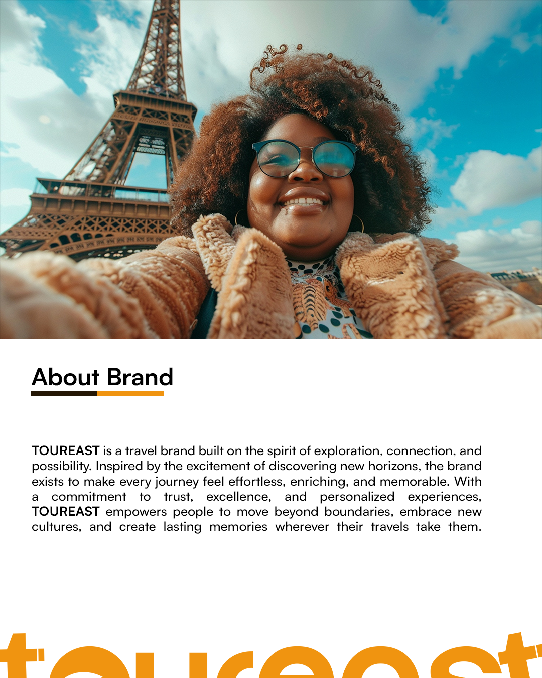
That absence of direction was actually the hardest part. It's easier to design against a brief than to help someone discover one. So before I opened Illustrator, I spent time understanding the business itself who they served, what made travel exciting to their clients, and what would make someone scroll past every other tour agency and stop at Toureast.
From there, I built their identity from the ground up: the logo, the color palette, the visual language that would carry across everything from their letterheads to their social pages. I wanted the mark to feel like movement like departure while still feeling grounded enough to be trusted with someone's travel plans and money. Every color choice was intentional; I leaned into tones that felt warm and adventurous without tipping into anything gimmicky or "touristy."
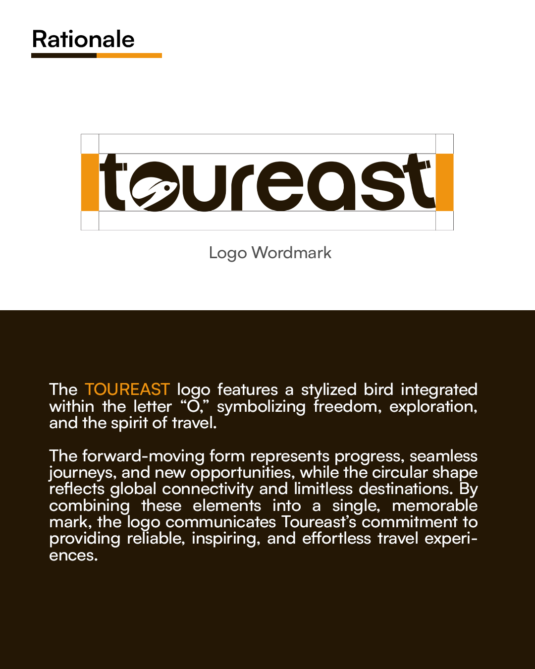
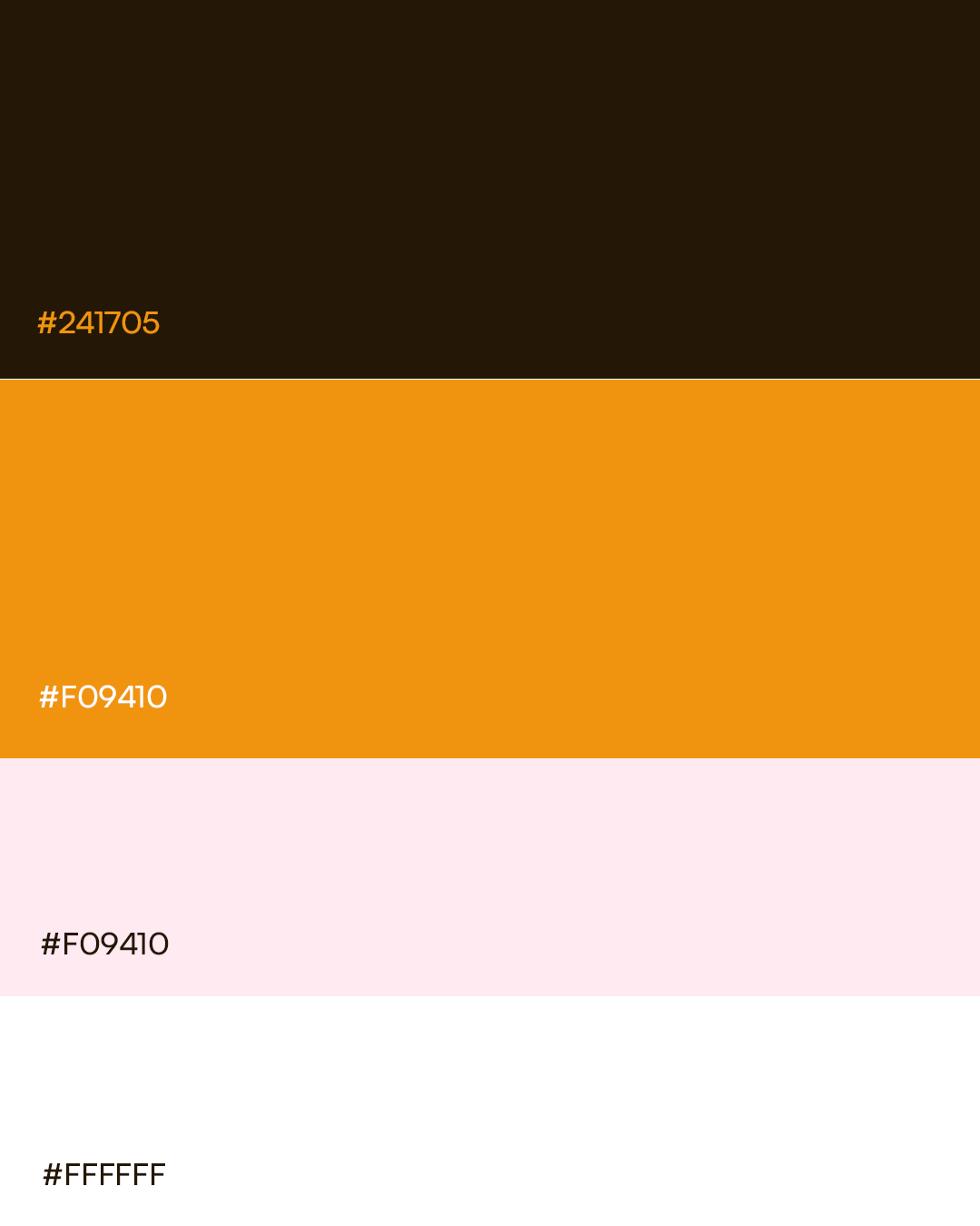
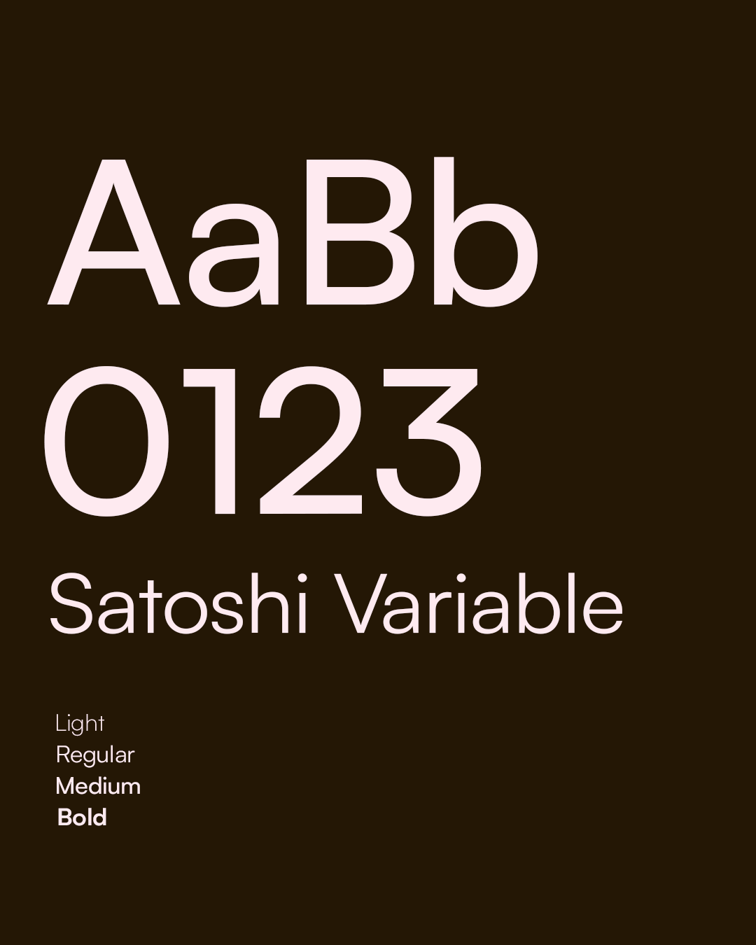
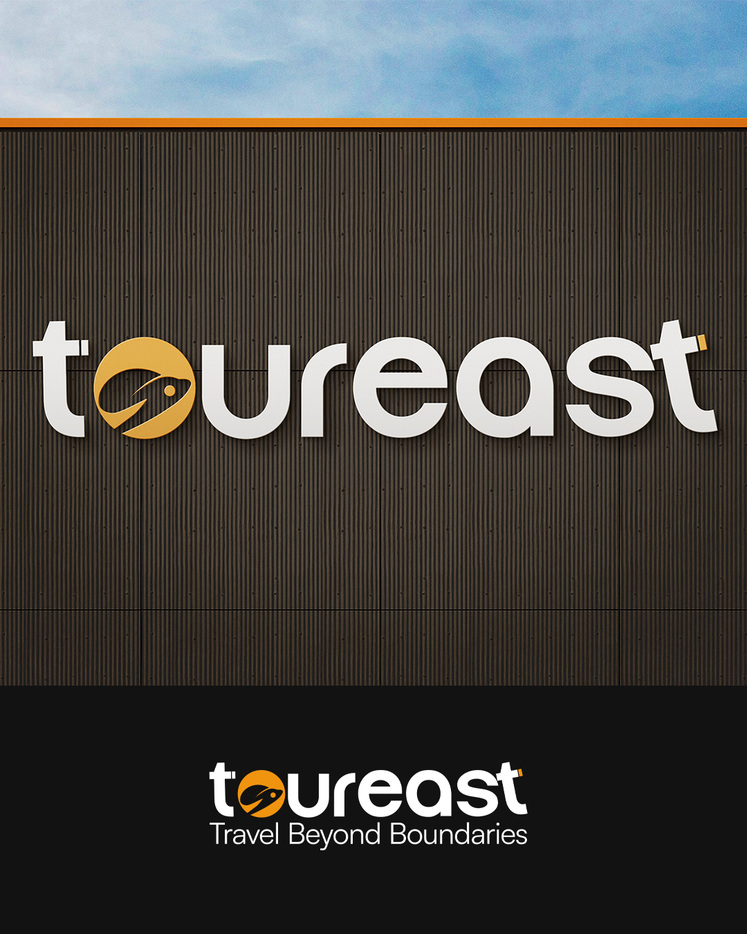
Working entirely in Photoshop and Illustrator, I went through more iterations than I'd like to admit before landing on a direction that felt right not just to me, but to a client who, at the start, couldn't tell me what "right" looked like. Getting them to a "yes" meant a lot of listening between the lines.

Looking back, Toureast taught me something I still carry into every project: sometimes the client doesn't need someone to execute a vision they already have. They need someone to help them find it. That's the job I fell in love with on this project, and it's the reason design still feels personal to me, project after project.
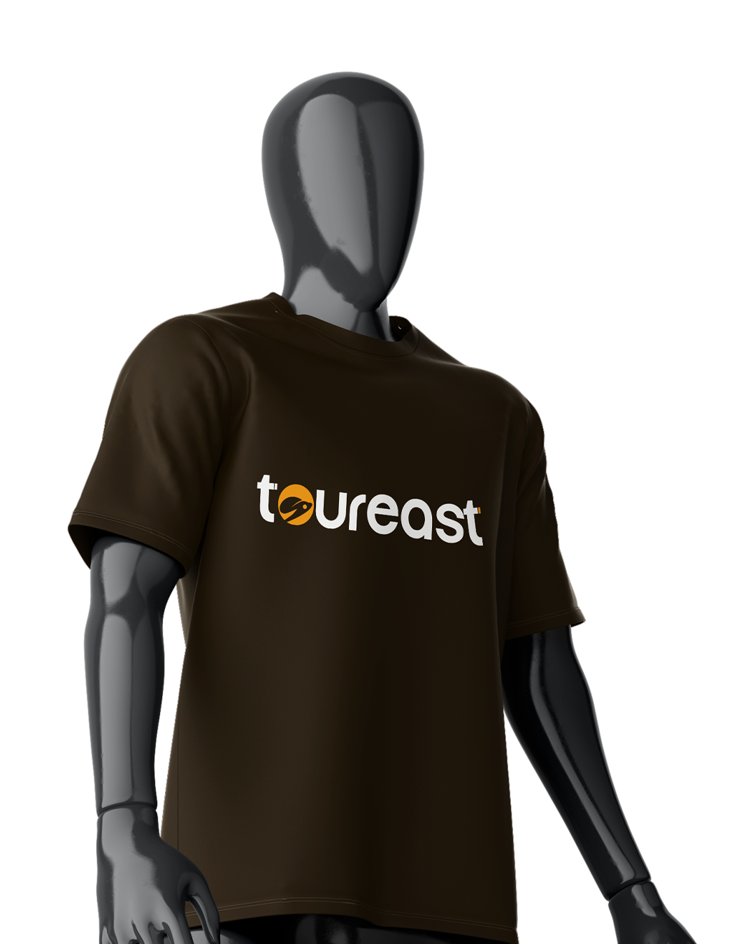
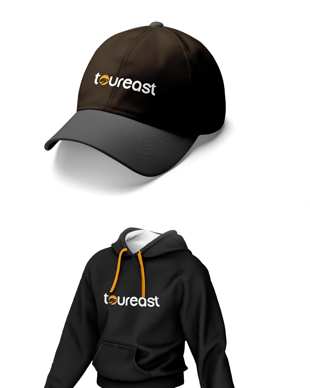
Tools: Adobe Photoshop, Adobe Illustrator Scope: Logo design, color system, brand identity foundation
Your email address will not be published. Required fields are marked *